Aisle 5 Oakland
Product Design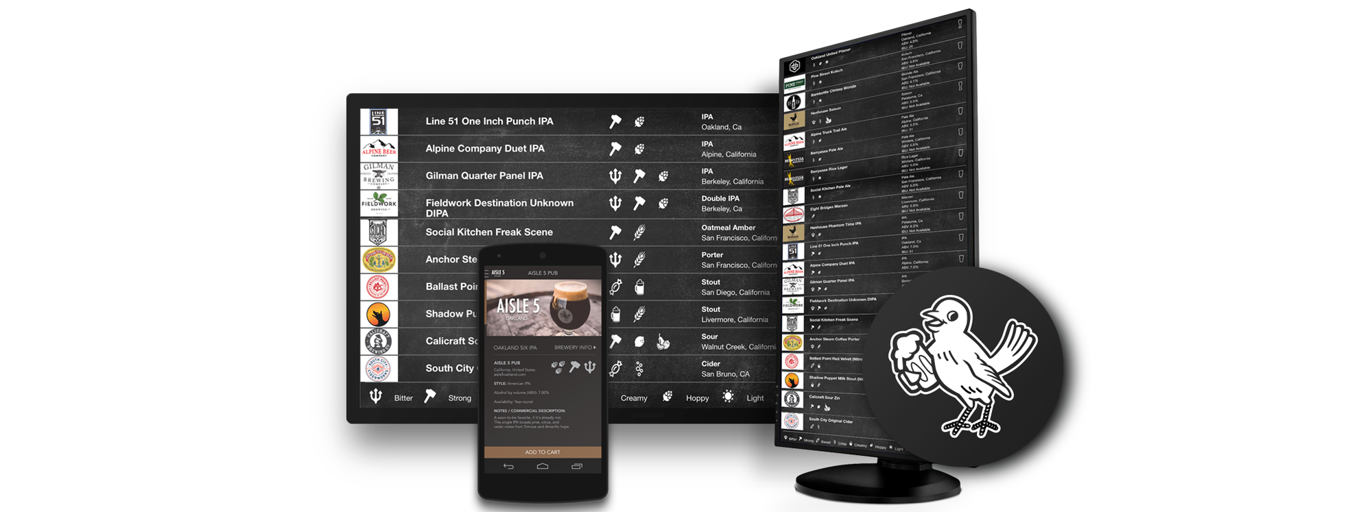
Aisle 5 Oakland
Product Design
Product Design
Craft Beer Pub | Oakland, CA
2015 – current
Craft beer with focus on technology and user experience
Aisle 5 is a craft beer pub and restaurant in the heart of Oakland located in the Grand Lake neighborhood— nestled a few doors down from the historic Grand Lake Theater. This original 1920’s building which is now the location of Aisle 5 has used current technology with a focus on the user experience to thrive as a business with steep competition. Lets take a look at our process.
Knowledge at a glance
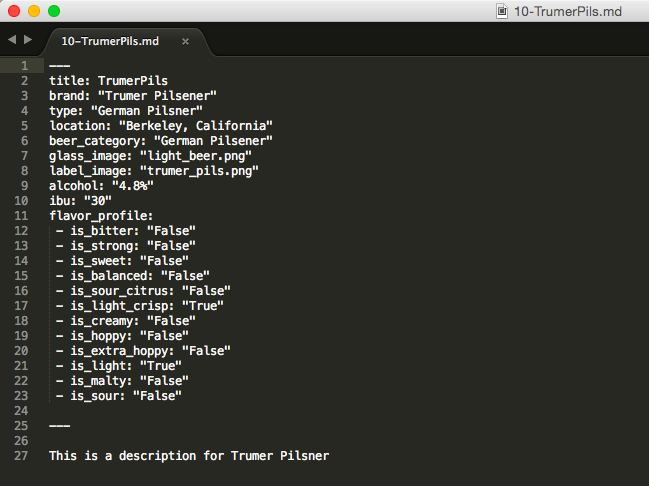
I was approached by this new business venture from a previous coworker. A CTO of a Fortune 500 company. He was really impressed by what I brought to the projects I’ve worked on and contacted me to help produce his vision. He knew from the beginning he wanted to have a digital menu, with live updating, a easy to understand iconic interface, and deliver knowledge at a glance.
Product Design
Craft Beer Pub | Oakland, CA
2015 – current
Craft beer with focus on technology and user experience
Aisle 5 is a craft beer pub and restaurant in the heart of Oakland located in the Grand Lake neighborhood— nestled a few doors down from the historic Grand Lake Theater. This original 1920’s building which is now the location of Aisle 5 has used current technology with a focus on the user experience to thrive as a business with steep competition. Lets take a look at our process.
Knowledge at a glance
I was approached by this new business venture from a previous coworker. A CTO of a Fortune 500 company. He was really impressed by what I brought to the projects I’ve worked on and contacted me to help produce his vision. He knew from the beginning he wanted to have a digital menu, with live updating, a easy to understand iconic interface, and deliver knowledge at a glance.
Requirements and constraints gathering
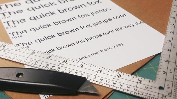
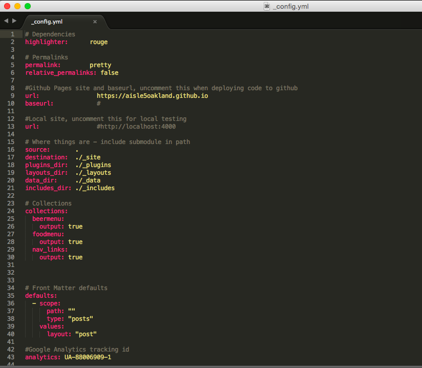
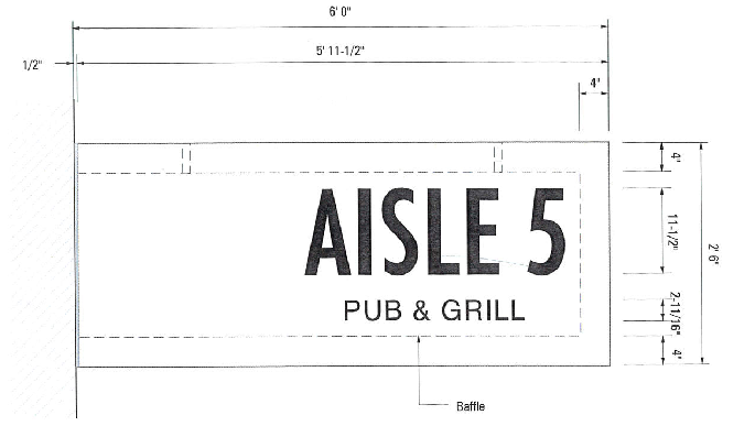
We knew immediately what our means of delivery would need to be. We were going to use digital displays (HDTV screens) to deliver the content. The first step was to determine the physical size of the screen so that we could determine the viewing distance needed for readability. We had to print different text sizes and cut cardboard to the various sizes of TV’s and place them on the wall and see what was comfortable to read from the bar and dining seating.
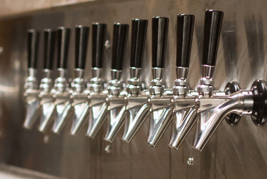
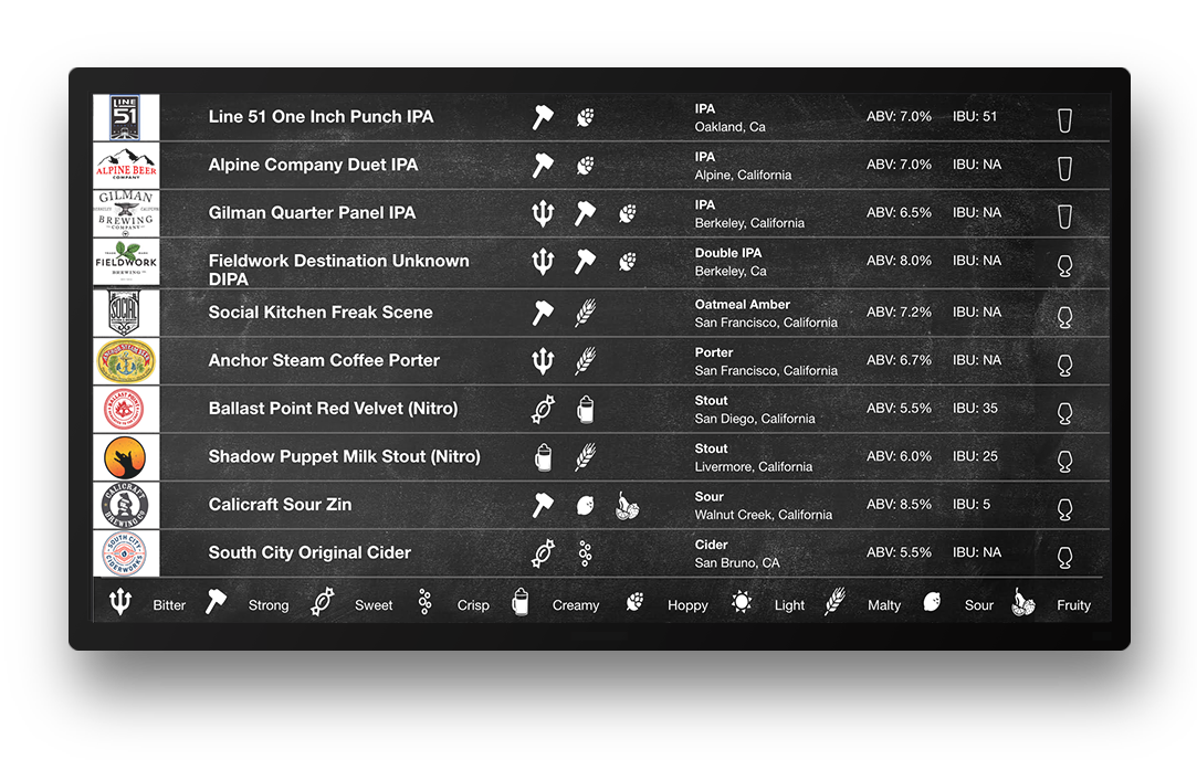
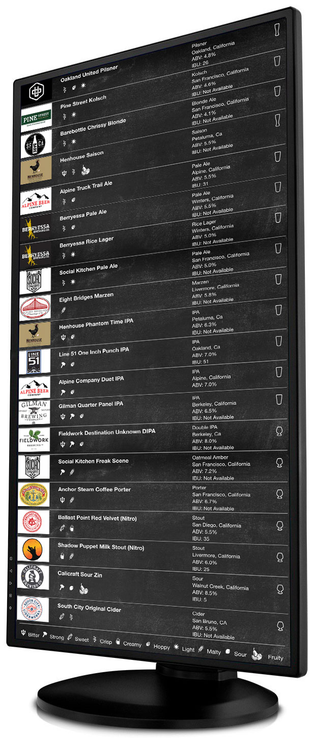
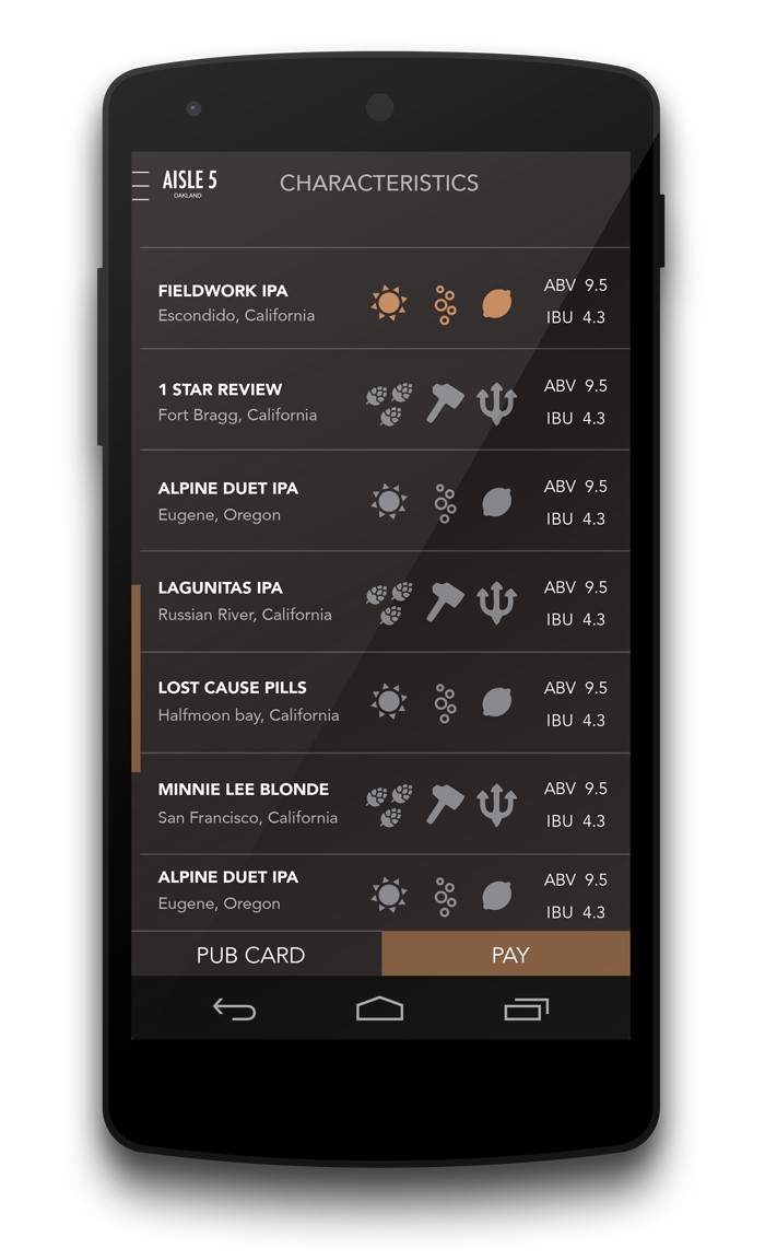
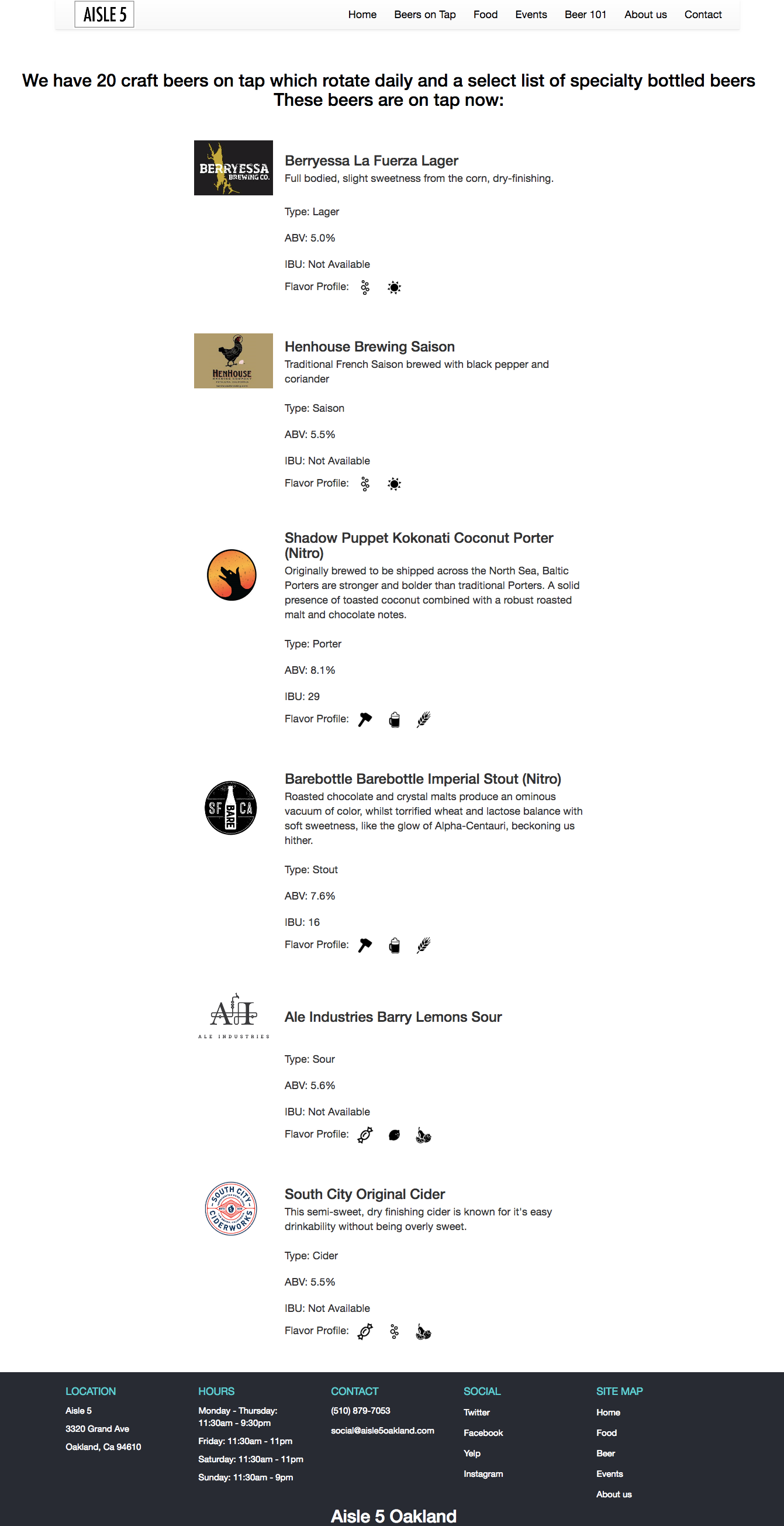
20 Beers on Tap — Clean Up Aisle 5
We needed to fit 20 beer listings on the screen. Twenty was the number of taps decided early on in the project. During early prototypes we played around with vertical screens. Quickly in the development we knew vertical would be a less useful option as we couldn’t play any sports or special events, so we decided to make the displays as useful as possible. Even though the original vision was to have vertical, we knew horizontal was a better choice for customers.

Requirements and constraints gathering
We knew immediately what our means of delivery would need to be. We were going to use digital displays (HDTV screens) to deliver the content. The first step was to determine the physical size of the screen so that we could determine the viewing distance needed for readability. We had to print different text sizes and cut cardboard to the various sizes of TV’s and place them on the wall and see what was comfortable to read from the bar and dining seating.
20 Beers on Tap — Clean Up Aisle 5
We needed to fit 20 beer listings on the screen. Twenty was the number of taps decided early on in the project. During early prototypes we played around with vertical screens. Quickly in the development we knew vertical would be a less useful option as we couldn’t play any sports or special events, so we decided to make the displays as useful as possible. Even though the original vision was to have vertical, we knew horizontal was a better choice for customers.
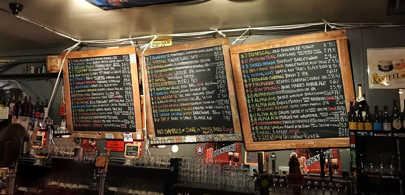
Competitive Analysis
Before sketching up a plan, what we found when scouting other craft beer business was a bulky chalkboard menu, that was ever-changing (therefore had old chalk crust or marker residue), hard to read, hard to write on and creative solutions were begging for improvements.
With a look into how our target persona would behave, we decided to create a digital menu based on the craft beer scene. We had the advantage of large digital displays, so we set off to create a beer menu to reflect our technological skills and provide great usability for our customers.
User interviews and field test studies
We went out to the field to test user feedback. We gathered information by asking people what issues they had with the ordering process and finding information about the beers.
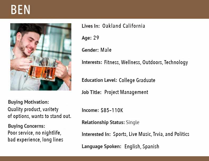
Target customer avatar
We created a customer avatar to guide us through our decision making and to help focus on engaging our audience based on the target. We knew we wanted an adult male living in the area approx. 25-38 years old with a yearly income of $85-110K named Ben. Ben enjoys craft beer, working nearby in tech, also enjoys business meetings over a pint, late night social hour, sports, politics, and exploring new avenues of entertainment.
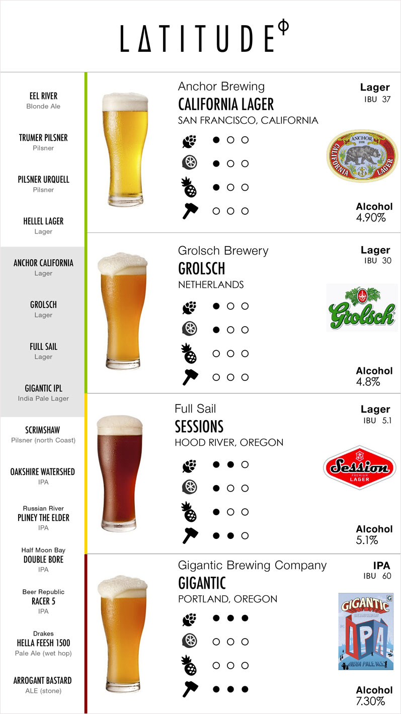
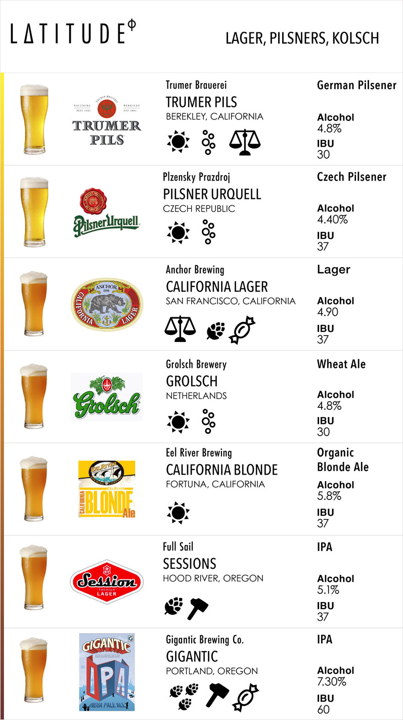
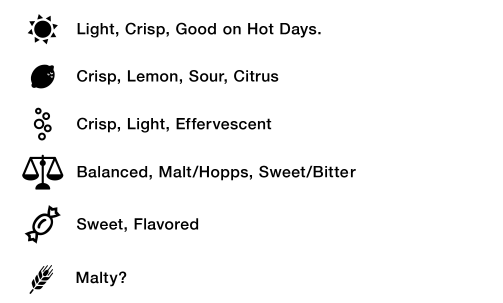
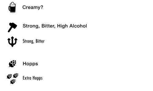
Crafting description icons
The icons went through a few iterations based on flavor aspects of the beer characteristics that we thought best represented the beer flavor differences. After a few tests we found out customers were wanting different flavors to be presented and a couple other flavors that were not doing anything for the customers so we made adjustments to reflect the customer choices.
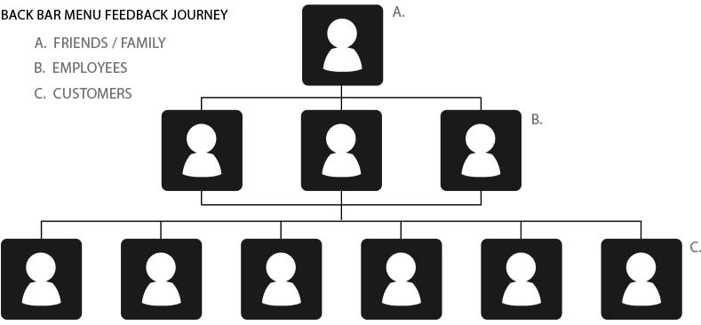
Prototype feedback and testing
To gain feedback information we relied firstly between each other, then our family/friends, employees, and finally the customers before an official grand opening.
Design Reviews
We delivered what we found was an excellent easy to read, understand, and live updatable user interface. It reflected the look and feel of traditional craft beer chalkboard menus yet being highly readable and understandable through layout, hierarchy of type, and descriptor icons. Customers would be able to assist themselves without a bartender or a long list of flavor descriptions to clutter the menu and shorten the ordering process.
Usability testing
We discussed visibility, legibility, characteristics profiles, and eye flow – with friends, staff, customers, and stakeholders. We then made improvements based on feedback and goals.
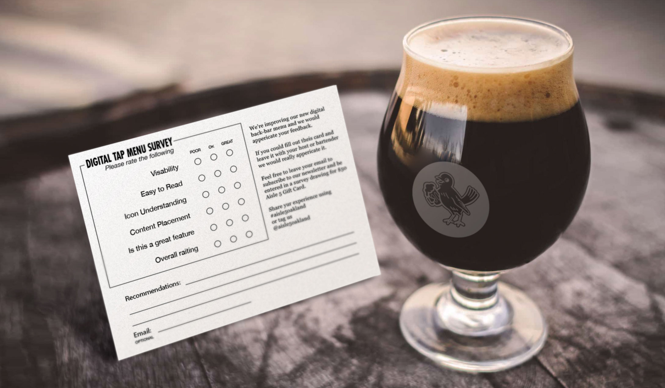
Customer surveys and user-generated reviews
Customer survey cards were printed out for the soft opening of the pub. Using feedback from customers, family, and staff we were able to make early decisions on the product before opening to the public.
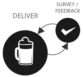
After the grand opening user-generated reviews offered amazing feedback. We could adapt and make changes very easily with review offers, social media engagement, and in-store surveys.
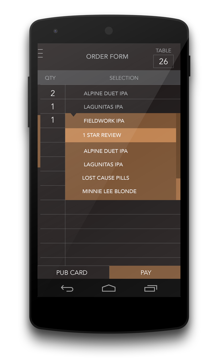
Beer ordering application
Order rounds of beer using our application table-side.
Look and feel
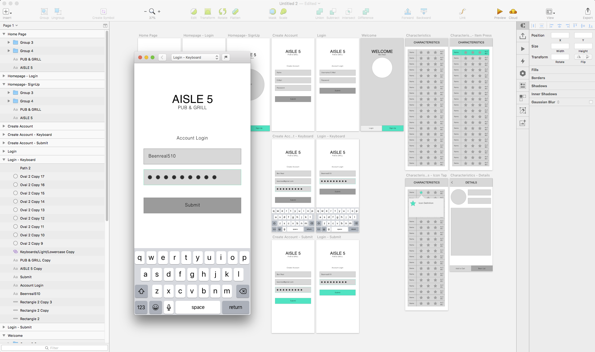
We wanted the look and feel to be similar to a game scoresheet. Sketches and wireframe mock-ups using the beer characteristics from the menu led us to create the content and UI we needed.
Task analysis
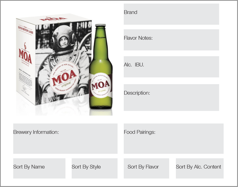
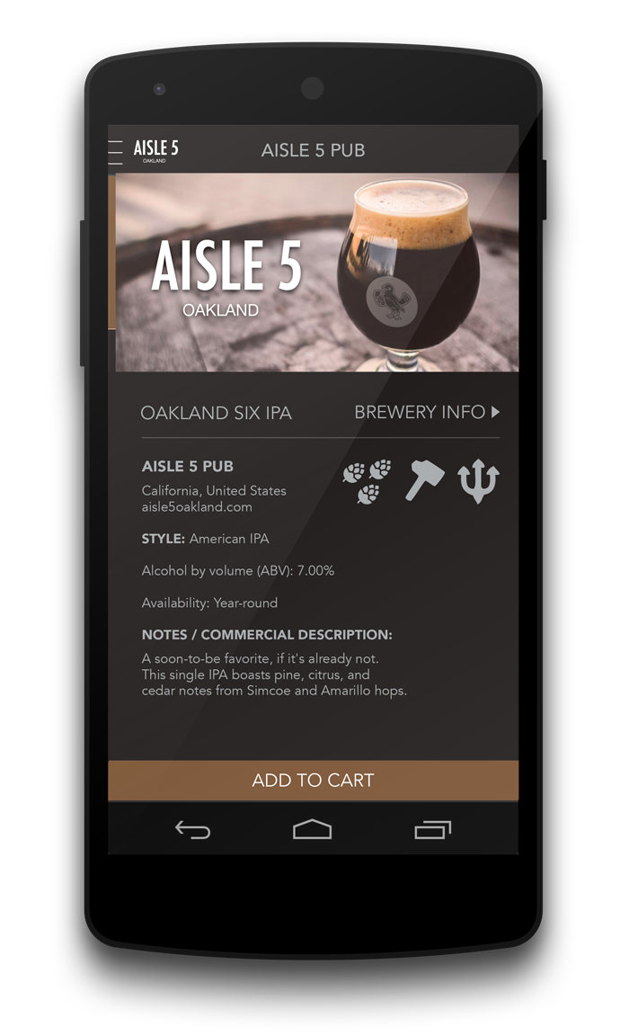
Looking at what we wanted to present to customers while streamlining the process, we decided on specific beer characteristics along with the logo of a from the particular brand. What we decided was a logo, brand name, make name, location origin, beer color, style, alcohol content, IBU, and glass style– along with flavor profile icons to remove descriptors and make selection easier.
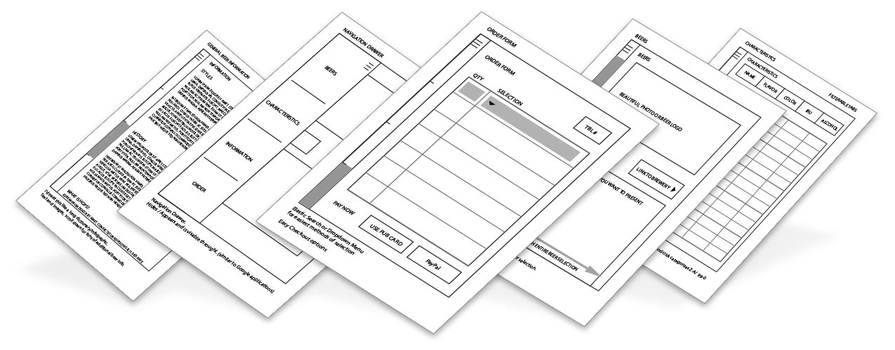
Wireframe app mockups
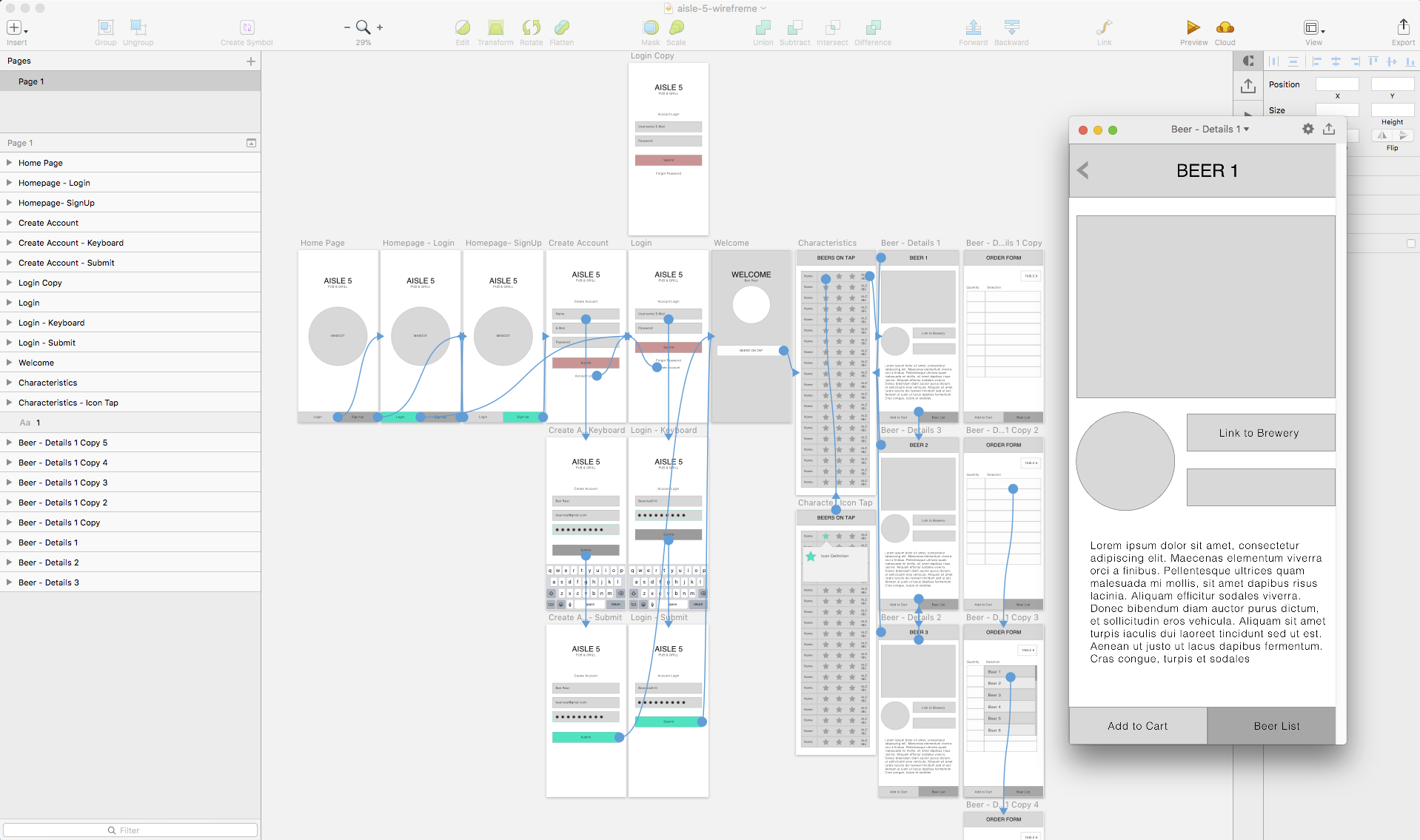
High fidelity mock-ups
Analytics review
With analytics we are able to track purchases and see users interacting with the app and website. We can therefore determine goals for sales and make changes to the beer display. Also to see what users are up to on our website and app to understand where they go, pain points, exits, and sales.

Mascot Design
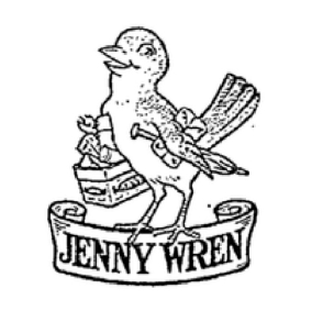
Original 1920’s logo
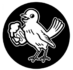
Revised Aisle 5 mascot
Other key challenges and solutions
- Interior & Exterior Design
- Sourcing
- Menu & Print Design
- Sewing & Decor
- Illustrated and Framed Art
- Apparel
Reviews
Aisle 5 had challenges along the way. Using analytics data and feedback with crowd-sourced reviews we were able to adeptly react and see where costs could be cut, solutions could be made, streamlined and improved. Testing has made this pub able to stay in business past the “two year” mark in which most restaurants fail before they reach.
The pub has grown and has established itself as a staple in the area. Our display idea led to trivia games, and special events— in which Aisle 5 had a full house for local and games and events. I feel honored to have been involved in such a fantastic project from conception to completion. I hope they thrive for many years to come.