Hewlett Packard Enterprise
UI/UX Design | Branding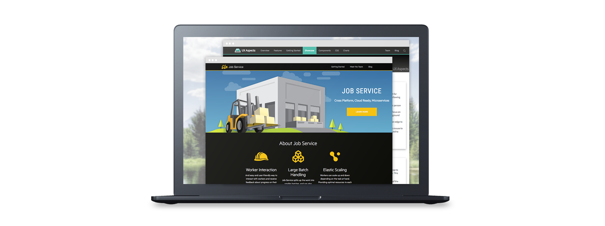
Hewlett Packard Enterprise
UI/UX Design | Branding

UI/UX Design | Branding
Enterprise Information Technology
2015-2017
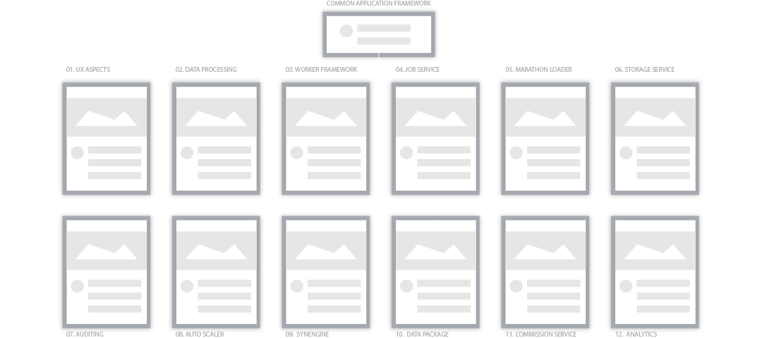
Common Application Framework
HPE’s collection of essential micro-services API’s for any developer of big data applications.
My Role
I led the design of all UI assets and accessibility evaluation. Assisted with the framework and interface design, design reviews, and gathering of requirements and constraints. I worked directly with the VP of Development in Palo Alto and the Autonomy Big Data Business department in Ireland.
UI/UX Design | Branding
Enterprise Information Technology
2015-2017
Common Application Framework
HPE’s collection of essential micro-services API’s for any developer of big data applications.
My role
I led the design of all UI assets and accessibility evaluation. Assisted with the framework and interface design, design reviews, and gathering of requirements and constraints. I worked directly with the VP of Development in Palo Alto and the Autonomy Big Data Business department in Ireland.
Discovery
Requirements and constraints
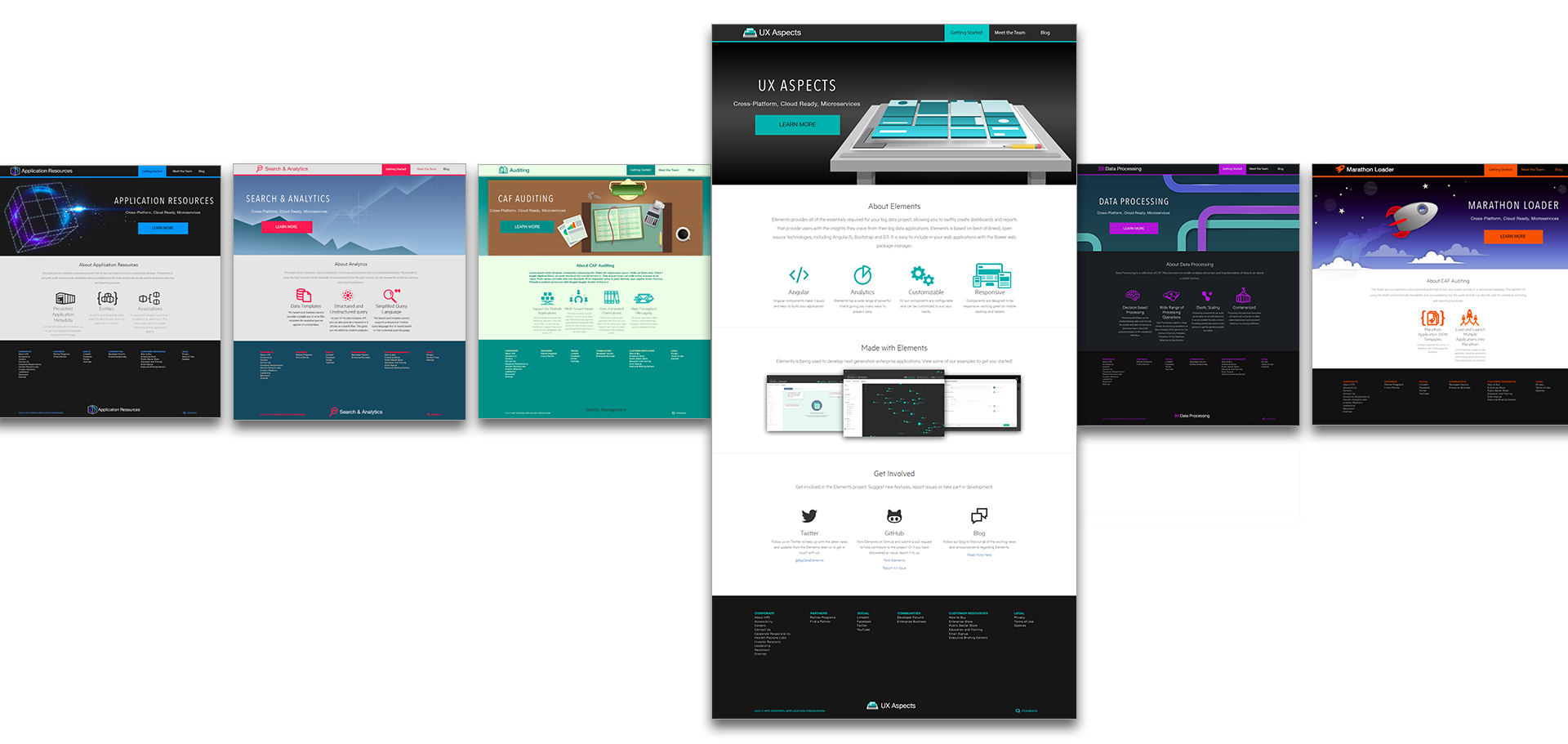
Our goal was to design and brand a collection of 12 micro-service sites for big data developers. Each sites design pattern needed to be similar across all of the micro-sets. Branding was also required and needed each to be unique but also similar enough to appear as a collective set.
Before I was brought onto the project, what existed was very corporate looking in-cohesive experience. The team wanted to build a fun and exciting interface in which big data applications could be easily built.
Exploring
Task analysis design review
We looked at user statics to see the amount of users on each set to prioritize the site. We also looked at documentation quantity on the each API. From those statics we were able to focus on one item as a priority in which to build the others.
We used a classic design pattern for the site framework and utilized collapsable navigation on the documentation.
Discovery
Requirements and constraints
Our goal was to design and brand a collection of 12 micro-service sites for big data developers. Each sites design pattern needed to be similar across all of the micro-sets. Branding was also required and needed each to be unique but also similar enough to appear as a collective set.
Before I was brought onto the project, what existed was very corporate looking in-cohesive experience. The team wanted to build a fun and exciting interface in which big data applications could be easily built.
Exploring
Task analysis design review
We looked at user statics to see the amount of users on each set to prioritize the site. We also looked at documentation quantity on the each API. From those statics we were able to focus on one item as a priority in which to build the others.
We used a classic design pattern for the site framework and utilized collapsable navigation on the documentation.
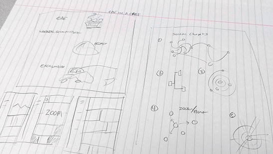
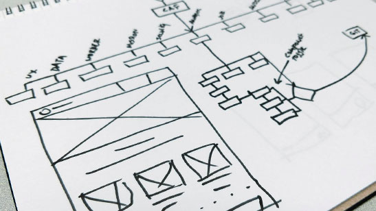
Usability workflow
Mapping workflows on paper, sketching out unifying options, and finding ways to establish cohesion on paper helped me to understand particular points where we could solve problem points as well as highlight opportunities where form and function make for a more user friendly experience.
Sketching layouts
Sketching allowed me to work more rapidly and led me to consider more opportunities faster. It also assists with the freeing of ideas, quicker brainstorming, and getting a better understanding of the problem vs. solution opportunities to reach the conclusion.

Customer user statistics
Our analytics showed us which applications had the largest amounts of users while our development teams knew which services had the most documentation. Therefore we’re able to understand the priority and specific needs of our customer to base our primary layout for the UI and UX.
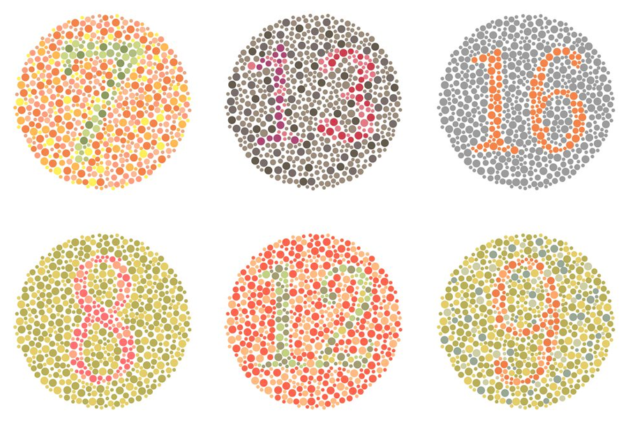
Accessibility evaluation
The API’s are for building actual applications. They feature sets such as UX design, security, usability, etc. A major concern on some of the UX and usability services was to make sure we were making services truly “useable”. Using colors that were colorblind accessible, I was able to develop a color story for the sites and test it against 3 different color blind users.
Concept analysis
Working remotely with development teams in Ireland over the email and WebEx meetings— our task was to analyze each micro-service individually, understand its purpose, and float ideas for the UI/UX development. Along with the branding, style, and theme design.
Remote qualitative usability testing
The overseas team and I were able to use GoToMeeting to observe moderated tasks for remote usability tests on the early design and framework.
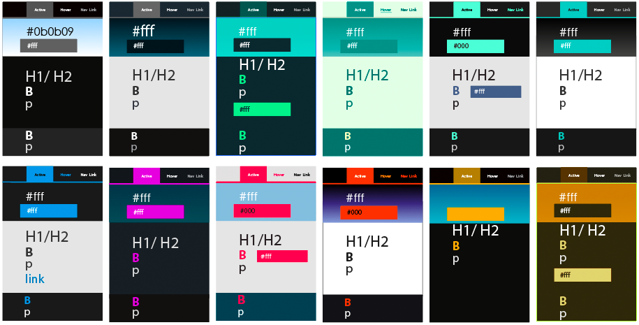
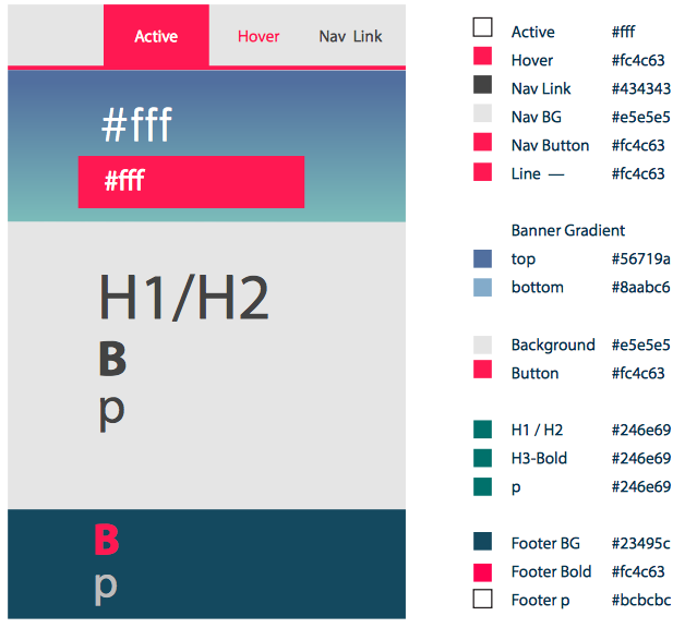
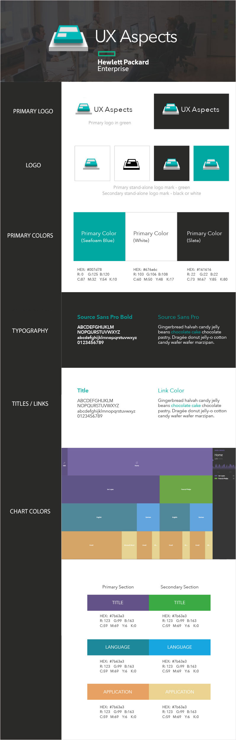
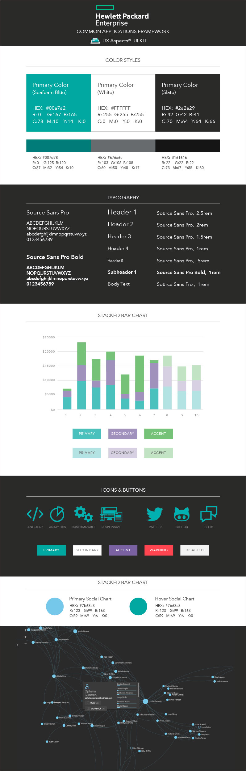
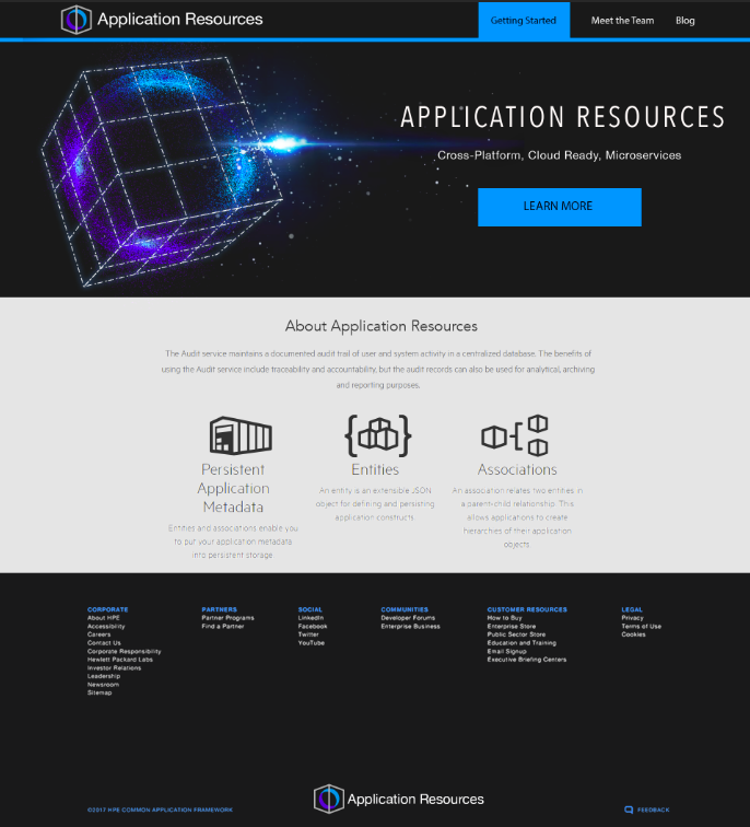
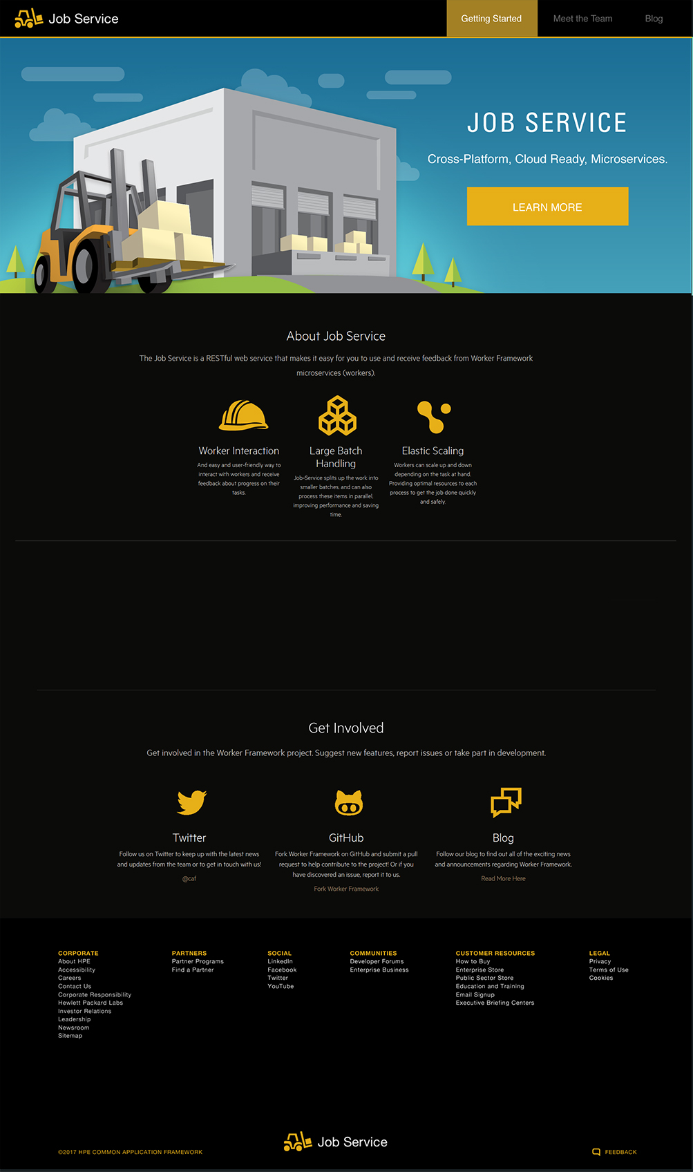
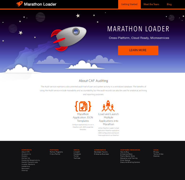
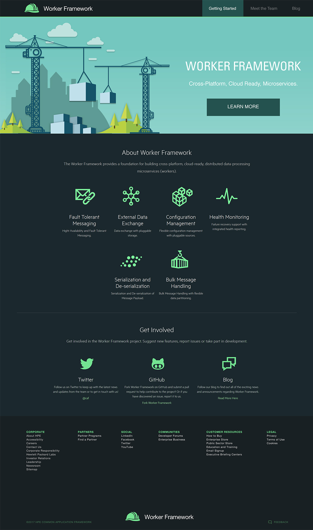
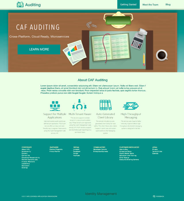
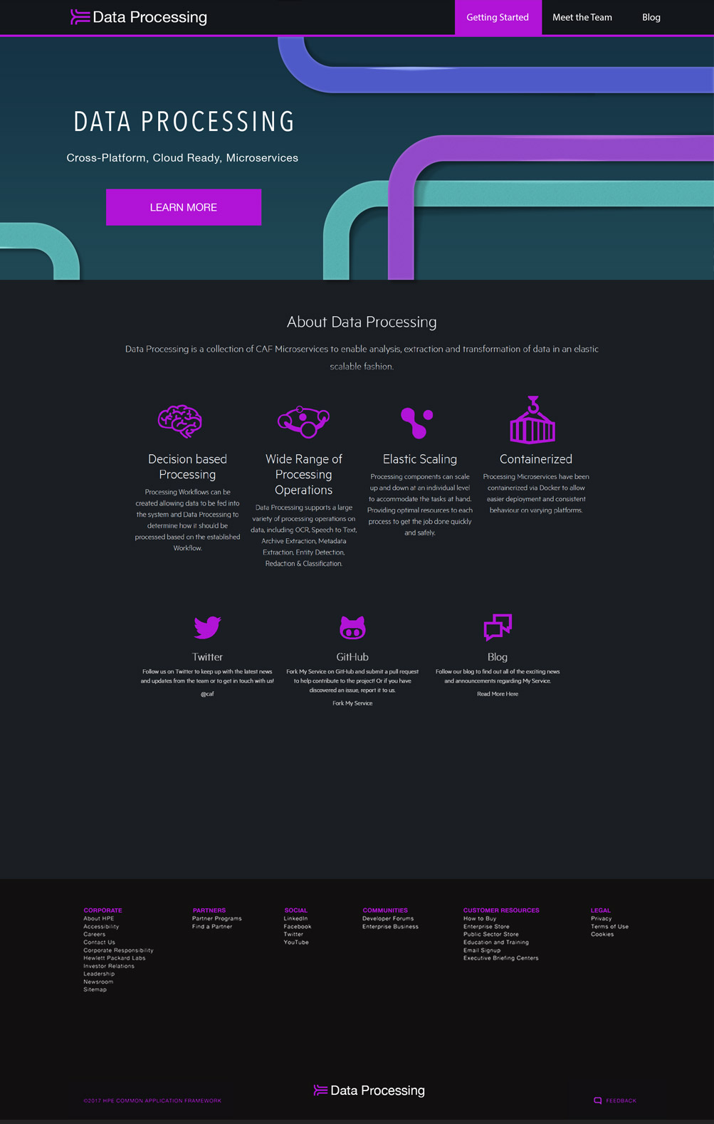
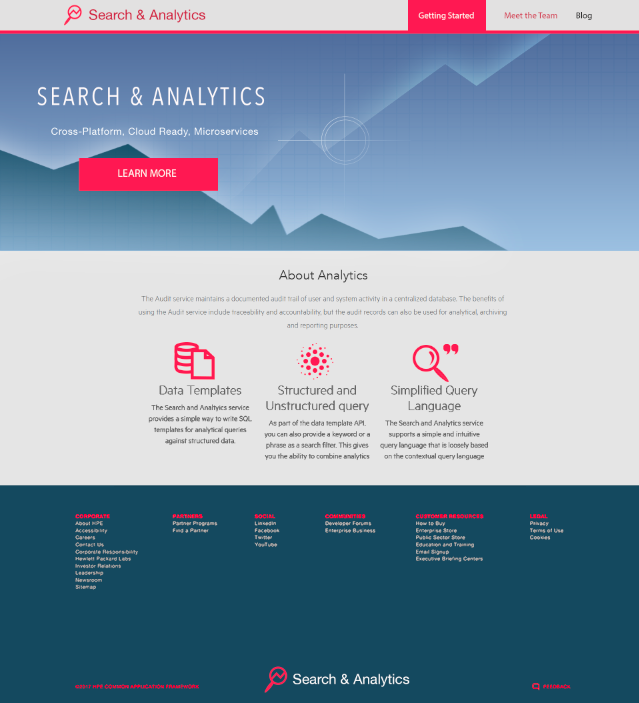
Overall color branding and palette
The collection needed to be visually different from each other in the color palette. We wanted to use visually impressive colors to avoid being corporate looking while looking bright and contrasting. Also using a palette to match the service brandname and tie the service together as its own brand.
Solutions
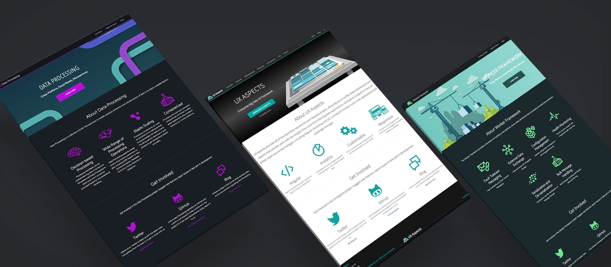
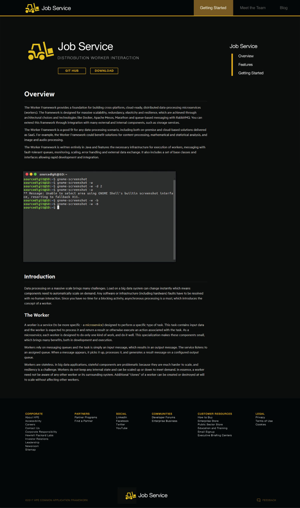
What we developed were 12 very similar site structures with a traditional web layout. We decided on this for the ease of use and to be less complicated for customers to find what they’re searching. Pages with massive amounts of documentation utilized anchor tags and collapsable information hierarchies to keep users from going back and forth navigating separate page– therefore keeping them on one page for easy access to information.
To define the micro-service sets, color was used as a defining element for the individual branding. We focused on the color, logo similarities/differences and a hero graphic that was on brand to the title of the API service, the color, and logo story to help users navigate between the services.
Delivery
We delivered 12 original products complete with cohesive structure, individual branding, and a very useable color palette for easy understanding of the application features. Plus the look and feel of being non-corporate and fun for developers to be excited about and deploy.
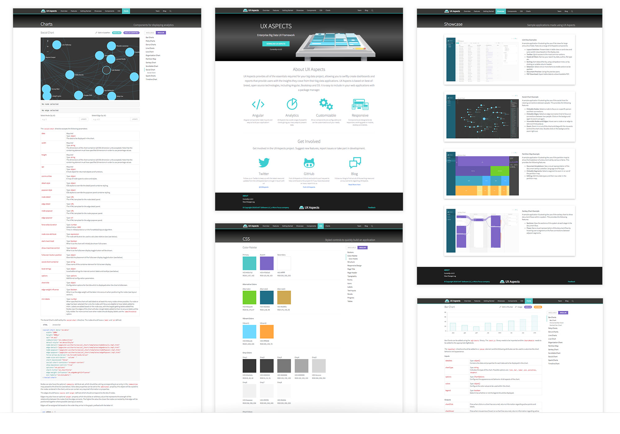
Patterns across the micro-services
The complete set of micro-services featured the same structural design patterns for ease of navigation between all sets. The defining features were the unique branding and color stories developed to differentiate and deliver the micro-service sets.

Outcome
Today the Common Application Frameworks are still being used for big data applications by HPE. The Ireland and US teams were really excited and enjoyed the outcome. The experience and usability greatly exceeded their goals and they were very pleased with the results.
Developing the easy to navigate sites, the color stories, logos and visual elements helped users greatly to navigate between services and to not get lost with the vast amounts of data.
Overall this was a fun and exciting project which allowed focus both on usability, user experience, interface design and branding of a group of 12 individual yet collective projects.